Pulse Dashboard Fundamentals
Adapted from the PULSE Dashboard & Reporting Software Fundamentals Training handout (PDF, June 2023), the printable companion to our fundamentals training class.
This is the orientation we give a new Pulse Dashboard user: how to get your data on screen, how to change what a report shows, and how to hand a finished view to a colleague. Nothing here needs a report writer or a call to IT — every change described below is one you make yourself, from the report in front of you.
Getting started
- Spend 10 minutes a day for the first few weeks getting comfortable with the reports. That is more useful than one long session.
- Pinpoint the 10 reports you want to use every day, and start there rather than at the top of the module list.
- You cannot change someone else's reports by accident. What you change is your own dashboard, so experiment freely.
Five things account for most of what you will do. Master these and you can create or modify almost any report:
- Sorting
- Filtering
- Grouping
- The Column Chooser
- The right mouse button
What people look at first
Based on what customers tell us they use, these are the views that earn their keep first — roughly in order of popularity:
- A top-level overview of pending and invoiced customer orders
- Production component shortages
- Customer sales against your forecast
- Inventory status — trends, months on hand and activity
- Product costing and margin analysis
- Past-due purchase orders, and orders that should be closed
Refreshing your data
Reports show the data pulled from Macola® the last time they were refreshed, so a refresh is usually the first thing you do when you start Pulse Dashboard.
| To refresh | Do this |
|---|---|
| Every module, or the one you are in | Click Refresh All Modules or Refresh Current Module at the top of the screen |
| One tab | Right-click the tab name and choose Refresh Tab, or double-click the tab header |
| One report | Click the refresh icon in the report header, or double-click the blue report header bar |
Tip
Refresh only what you use daily. For a tab you open occasionally, right-click the tab name and clear the Refresh with Module checkbox. That tab then refreshes only when you ask it to, and every module refresh after that is quicker.
The icons on every report
Each report carries the same set of icons in the top right corner of its header.

| Icon | What it does |
|---|---|
| Prints, exports or emails the report | |
| Excel | Exports the report to Excel exactly as it appears on screen, with the report and column headers |
| Refresh | Reruns this one report against your Macola® data |
| Setup — the red wrench | Controls the report's own settings: the dates calculations are based on, how many months to show, which accounts to use and more |
| Filter | Narrows what the report retrieves, on one or more columns |
The Excel icon at the top of the screen, next to Refresh All Modules, does something broader: it exports every report on the current tab.
Adding a tab
Your own tabs are where you keep the reports you have arranged for your job.
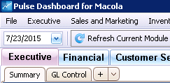
Click + at the end of the row of report tabs. The new tab arrives empty, ready for you to add reports or copy them in.
Adding reports to a tab
There are two ways to fill a tab:
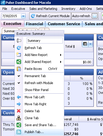
- Right-click inside the empty tab, or on the tab name, and choose Add New Report to pick a standard report.
- Copy an existing report from another tab or module, then change your copy.
The tab's right-click menu is worth learning early — most of what you do to a tab lives there.
Changing the columns on a report
The Column Chooser is available on most reports and drill-down reports, and it is the tool that turns a standard report into yours. Columns can be added, removed and re-ordered, and you can build new columns from a formula.
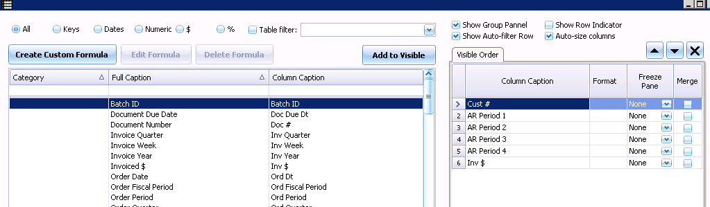
When you have finished choosing columns, click OK to save the layout and return to the report. Everyday tips lists the format codes the Format column accepts.
Sorting a report
Double-click a column header to sort by that column, or right-click the header and choose Sort Ascending or Sort Descending. Clear Sorting puts the report back the way it was.
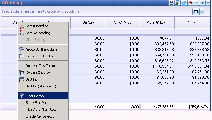
The same menu holds Group By This Column, which is how you get subtotals by customer, vendor, item or product category.
Filtering a report
A standard report often carries more than you need. Filtering is how you narrow it to one customer, one product category or one buyer's items. There are several ways in, and they suit different jobs:
- The Filter icon in the report header builds the filter at the server, so less data comes back. This is usually the most efficient choice, and the one to reach for on a large report.
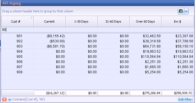
- The filter row — the blank line under the column names — filters on what you type, matching any value that contains it.
- Filter Editor, from the column header's right-click menu, builds a filter with more than one condition: and, or, <, >, between, and the values to compare against.
Publishing a tab to your colleagues
Publishing works at the tab level: it sends an entire tab of reports to another user's dashboard. Right-click the tab header and choose Publish Tab. The next time that user starts Pulse Dashboard, the new tab is there.
Publishing may be switched off for your login
Some sites turn publishing off for some users. If Publish Tab is missing from your tab menu, that is why — call our support desk and we will tell you how your system is set up.
Keep a test tab
When you want to change a report, add a new tab first and copy the report onto it. You then have a test area that leaves the original untouched. If the new version doesn't work the way you hoped, the report you started from is still where it was.
Where to go next
- Everyday tips — right-click menus, tab colors, number formats and sharing your work
- How Pulse Dashboard works — what is happening behind the refresh, the filter and the drill-down
- Training and webinars — the 55-minute fundamentals class, plus advanced sessions for report builders
- How Pulse Dashboard calculates its numbers — what each figure on screen is derived from
- Catalog of custom report tabs — pre-built tabs you can ask us to send you
Tip
Need a hand? The PULSE support team is happy to help — call (513) 723-8095 or email [email protected]. Support and training come with Pulse Dashboard, so there is no clock running on a question.