Pulse Dashboard Advanced Techniques
Adapted from the Advanced Techniques user training handout (PDF, October 2019), the companion to our advanced training class.
Pulse Dashboard lets you build custom reports from Macola® data without a programmer. Once the basics are comfortable — the fundamentals cover those — the techniques here are what turn a standard report into one built for your job: a report started from a clean slate, a column that holds your own formula, a tab published to a colleague, two reports linked side by side.
Start a report from a clean slate
You do not have to find a report that nearly fits. Take one that has the right underlying data, delete every column, and rebuild it from the Column Chooser. A customer-based report becomes an item-based report in a couple of minutes this way, because the columns available to it are wider than the columns it happens to show.
These reports are the usual starting points, one per module:
| Module | Report to start from |
|---|---|
| Executive | G/L Control |
| Customer Service | Customer Orders Dynamic View |
| Sales & Marketing | Sales Analysis |
| Inventory | Inventory Status |
| Purchasing | Purchase Order Receipts |
| Production | Production Orders |
| Designer | Query Analyzer |
Several Executive module reports also have a Presentation Mode in their setup (the red wrench icon). Switching from Summary to Detail brings the drill-down detail onto the main screen and gives you the Column Chooser there as well.
The Column Chooser options worth knowing
Four checkboxes sit at the top right of the Column Chooser, and they change how the report itself behaves rather than which columns it shows:
| Checkbox | What it does |
|---|---|
| Show Group Panel | Displays the strip you drag a column header onto to group and subtotal the report |
| Show Row Indicator | Numbers the rows — what makes a report read as a top-10 list |
| Show Auto-Filter Row | Shows or hides the blank filter line under the column headings |
| Auto-size Columns | When on, column widths reset on every refresh; turn it off to keep the widths you set |
On the right-hand side, each selected column has three settings beyond its caption:
- Format controls decimal places, currency and percent signs. Everyday tips lists the codes.
- Freeze Pane pins a column so it stays put while the report scrolls sideways, exactly like Excel. None, Left or Right.
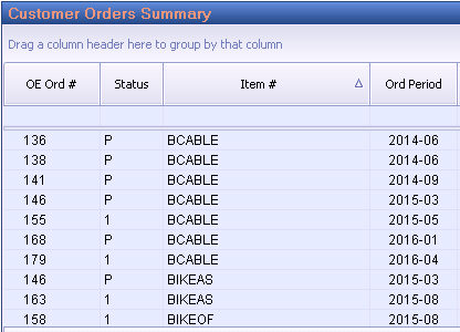
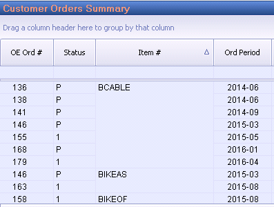
- Merge removes a repeated value in a column until it changes, which is the difference between a wall of identical item numbers and a report you can read at a glance.
Renaming a column
The Column Caption can be edited to whatever your company calls that field — worth doing where Macola®'s user-defined fields carry a meaning only your business knows. Two things to keep in mind: you need administrator rights, and the change applies to that column on every report, for every user.
Columns that hold your own formula
Where a report needs a number that no column provides, build it. Create Custom Formula in the Column Chooser opens the expression editor.
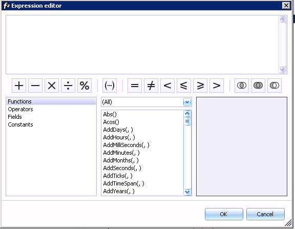
Two examples cover most of what people need: adding two existing columns together, and adding a percentage to an existing column. Both can then be formatted to whole dollars and given a total like any other numeric column.
Blank values break a sum
A column that is blank rather than zero will empty the whole result. Wrap each field in IsNull so blanks count as zero:
IsNull([Inv $ - Period 01], 0) + IsNull([Inv $ - Period 02], 0)
A custom formula belongs to the report it was created on. Share that report and the column travels with it; copy the shared report and the column is available on the copy. It does not appear on other reports, and formulas can be built from other formulas on the same report.
Publishing versus Save and Share
Both get your work onto a colleague's screen, and the end result is the same. The difference is who can do it and how the tab arrives.
| Publish Tab | Save and Share | |
|---|---|---|
| Who can use it | Users given Publisher rights by your administrator | Any user |
| How it arrives | The tab is added to the recipient's dashboard; it is there next time they start Pulse Dashboard | The tab is made available; the recipient adds it from the v icon at the end of their tab row |
| Overwriting | — | You can allow an existing tab of the same name to be overwritten, which is how you send an update |
Both are reached by right-clicking a tab header.
Designer module tools
These need the Designer module licensed.
Advanced Report Designer
Ordinarily a drill-down replaces the screen. The Advanced Report Designer keeps both reports visible instead, side by side or one above the other, and drives the second from whatever is selected in the first.
Add a new report, choose Advanced Report Designer from the Designer module, then copy and paste one Pulse Dashboard report into the first panel and a related one into the second. In the setup (the red wrench icon):
- Box Caption renames the combined report.
- Show second panel turned off hides the secondary report.
- Horizontal switches between top-and-bottom and left-and-right.
Beyond that, Add Custom Element Behavior defines exactly which values pass from the primary report to the secondary one, choosing from more than 2,100 predefined fields, and Edit Behavior of Selected Element narrows it to all columns, a single column or a custom field. It is powerful and easy to overdo — too much filtering here quietly excludes rows that belong on the report.
Query Analyzer
The Query Analyzer box runs your own SQL and displays the result as an ordinary Pulse Dashboard report: printable, exportable to Excel, filterable, groupable, shareable. Any table in the Macola® database will do, and so will any other SQL database — Exact Synergy tables, a quality system, a CRM, or tables built by your own stored procedures.
You can paste a script into the box or call a stored procedure with exec. The stored procedure is usually the better choice for anything several people run: change the procedure once and every user's next refresh picks it up, with nothing to re-share.
Two details save time. Enable advanced dashboard integration must be off to run stored procedures or to use an ORDER BY clause. And the full Column Chooser is not available here — right-click a column header, or click the middle mouse button, for a limited one covering the fields your query returned.
Writing your own SQL reports takes the Query Analyzer from start to finish: the editor, the optimized tables, the date filters, formatting, grouped headings, stored procedures and passing the tab's Pulse filters into a query. On Macola® Progression, writing SQL for Progression covers the two things that generation stores differently — dates as numbers, and text columns padded with spaces.
Embedding a report in the Item Details View
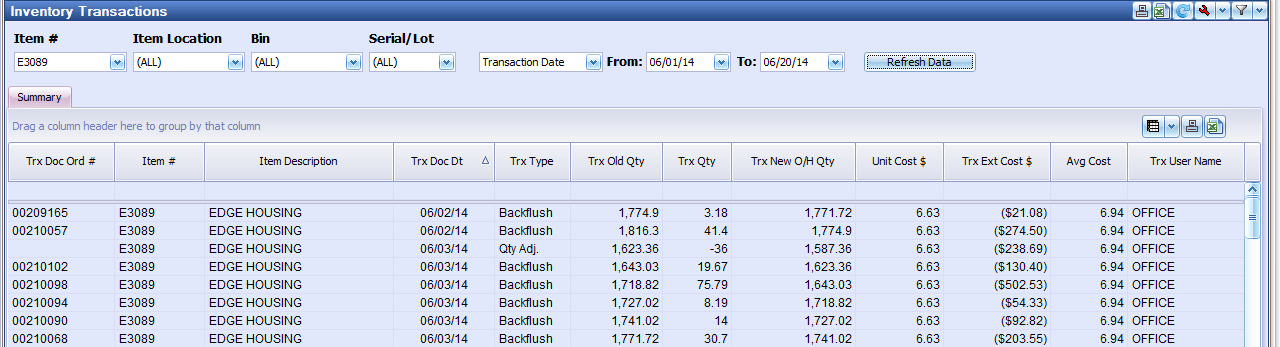
The Item Details View can carry your own reports as extra buttons. Create or open the report you want, copy it with Ctrl-C or right-click → Copy Report, then in the Item Details View setup (the red wrench icon) choose Add Report from Clipboard and set the Button Caption. Add several and each becomes its own button, so one screen answers several questions about the item.
Quick orders and production changes from a right-click
Right-clicking a number on a report reaches into Macola® rather than just rearranging the screen:
- On an item, customer or vendor number: create a customer order, a purchase order or a POP production order.
- On a POP production order number: change the due date, change the captured bill of material, report scrap, or report production — including bins, lots and serial numbers.
Collection notes on the A/R Aging report
The A/R Aging report can carry collection notes at customer level and at invoice level, with follow-up dates and your own priority codes. Add the columns from the Column Chooser, then right-click the notes field for a customer or invoice and choose Customer Collection Notes or Invoice Collection Notes.
| Column | What it holds |
|---|---|
| Customer Collection Notes | Notes about the customer |
| Customer Collection Modified Date | When the note last changed |
| Customer Collection User Name | Who changed it |
| Customer Collection Follow-Up Date | The date to come back to it |
| Collection Priority | Your own code — High/Med/Low, 1 to 5, whatever you define |
| Invoice Collection Notes | Notes about one invoice |
| Invoice Collection Follow-up Date | Follow-up date for that invoice |
The two invoice-level columns need the invoice number column on the report as well. In summary mode the notes go on the drill-down screen; in detail mode they can go on both. A Timestamp button stamps a name and time into the note, and Settings is where the priority codes are defined. A/R Collection Notes covers what the feature is for.
Restoring your own settings
Your tabs, reports, filters and columns are a user profile, held per user and per database. They can be exported to a file and imported again — to move your screens to another database, to hand a working set to a new colleague, or to go back to how things were. Restore Settings goes further and rolls your whole profile back to the state it was saved in on a date you choose, which is the way out of a tab deleted by accident. Administration covers both, along with resetting a user back to the company default.
Where to go next
- Pulse Dashboard fundamentals — the basics these techniques build on
- How Pulse Dashboard works — why a formula column behaves like a real one, why the Designer can pair any two reports, and why your own SQL still obeys the tab's filters
- Everyday tips — format codes, tab colors and the right-click habits
- Designer module — what the module licenses
- Administration — Publisher rights, company defaults and the tools behind these features
Tip
Need a hand? The PULSE support team is happy to help — call (513) 723-8095 or email [email protected]. Building a first custom formula or Designer report with someone on the phone is usually quicker than reading about it.